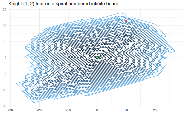
NumberPhile did a video on potentially infinite Knight Tours that I found quite interesting. I wanted to test out literate programming using Quarto to solve it and I did (result) 🙂
The RStudio integration with Quarto is really good and for a problem like this it really helps to keep your thoughts and code in the same place. Plots like this one that shows the complete tour are displayed inline and the experience is comparable with a Jupyter notebook with the advantage that it is not in the browser but in a polished IDE.
In my previous post I looked at the Tikz capabilities of ChatGPT. The quality of the graphics produced were above my expectations but I wouldn’t call them useful. While doing research for this interesting Quant.SE question I came up with a more interesting question. Can ChatGPT explain and plot option strategies? Turns out it can not but since I’m doing science on this blog, I share with you the results below anyways.
Maybe it can be coaxed into giving better results with better prompts. I’d be happy to hear if someone can. In any case, these were mine:
Please explain me some popular option trading strategies together with Tikz graphics For each of the graphics can you write Tikz code? Can you give me the Tikz code for a straddle, a strangle and iron condor as well
For some reason it got distracted when generating the graphs. The results are summarized below. Note again: this is all ChatGPT output, I only combined the graphics and compiled the Tikz.
Sure, I can explain some popular option trading strategies, but as a text-based AI, I’m unable to directly create Tikz graphics. However, I can certainly describe them in a way that can help you visualize and perhaps draw them yourself.
Long Call: This is the most basic options strategy. When you buy a call option, you’re buying the right to purchase a stock at a specified price (the strike price) before a specified date (the expiration date). You would use this strategy if you believe the price of the underlying asset is going to rise. Visualization: Imagine a graph with profit/loss on the Y-axis and the price of the underlying asset on the X-axis. The graph would be a diagonal line starting from the negative Y-axis (representing the premium paid for the call) and moving upward as the price of the underlying asset increases.
Long Put: This strategy involves buying a put option, which gives you the right to sell a stock at a specified price before a specified date. You would use this strategy if you believe the price of the underlying asset is going to fall. Visualization: The graph for a long put is a mirror image of the long call. It starts at the negative Y-axis (representing the premium paid) and moves downward as the price of the underlying asset increases.
Covered Call: This strategy involves owning the underlying asset and selling a call option on that asset. This is typically done when you believe the price of the asset will stay relatively stable, and you want to earn the premium from selling the call. Visualization: The graph starts at the Y-axis at the point where the premium for selling the call is added to the price of the asset. It then moves horizontally to the strike price of the call option, at which point it starts moving downward as the price of the asset increases.
Protective Put: This involves owning the underlying asset and buying a put option on that asset. This is done when you want to protect against a possible drop in the price of the asset. Visualization: The graph starts at the Y-axis at the point where the price of the asset is reduced by the premium for the put. It then moves horizontally to the strike price of the put option, at which point it starts moving upward as the price of the asset decreases.
Straddle: This strategy involves buying a call and a put option on the same asset with the same strike price and expiration date. This is typically done when you expect a big move in the price of the asset, but you’re not sure in which direction. Visualization: The graph for a straddle looks like a V, with the point of the V at the strike price of the options. The left side of the V represents the profit/loss for the put option and the right side represents the profit/loss for the call option.
Strangle: Similar to a straddle, but the call and put options have different strike prices. This is typically done when you expect a big move in the price of the asset, but you’re not sure in which direction, and you want to reduce the cost of the strategy by choosing strike prices that are out of the money. Visualization: The graph for a strangle looks similar to a straddle, but the V is wider due to the different strike prices.
Iron Condor: This is a more advanced strategy that involves selling a call spread and a put spread on the same asset. This is typically done when you expect the price of the asset to stay within a certain range. Visualization: The graph for an iron condor looks like a bird in flight, with the body of the bird representing the range within which you profit and
Just as the descriptions the graphics aren’t very good unfortunately. It seems to have to have difficulty with combining the different pay off structures of the parts of the strategy.
Sometime ago through HackerNews I found this experiment on drawing a unicorn with ChatGPT on the blog of Adam K Dean. The results left something to be desired. I prefer using Tikz instead of SVG so I decided to an experiment myself with reasonable results. First I wanted a simple sine wave. In 2014, during an interview, I was asked to sketch a sine wave on a whiteboard as a preliminary step for a problem the interviewers wanted me to tackle. Regrettably, I ended up poorly drawing a cosine wave instead. For ChatGPT however, it’s not a problem:
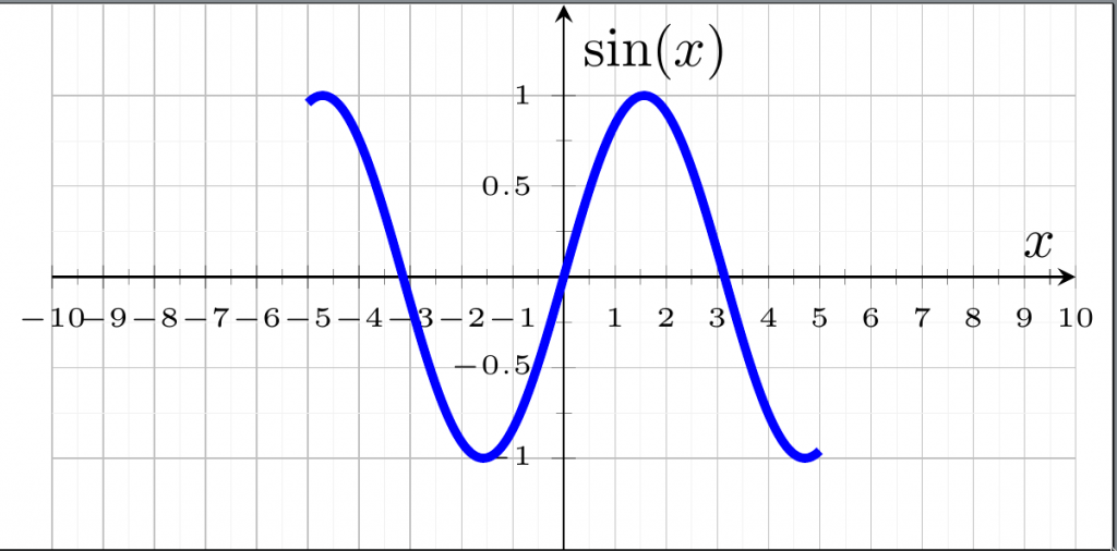
A rather detailed plot of a sine wave generated with the prompt: “Can you give me a sine wave plot with tikz”
This is pretty good, I know I would need to some searching to get to this. Next I wanted a house:
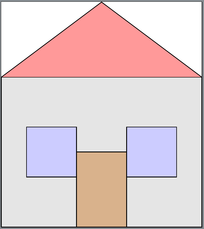
A very simple house created with Tikz and the prompt: “Draw a house in Tikz”
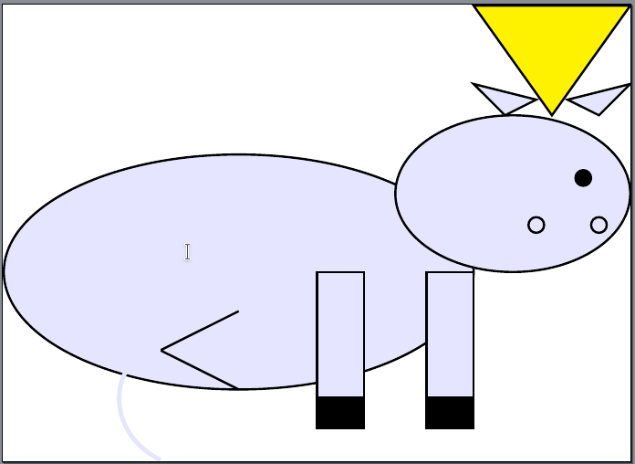
This is going better than expected, let’s try to draw a unicorn:
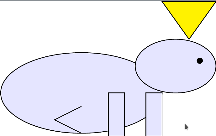
A simple unicorn generated with prompt: “Draw a unicorn in Tikz”
Please add some details:
After prompt: “Please add some details”
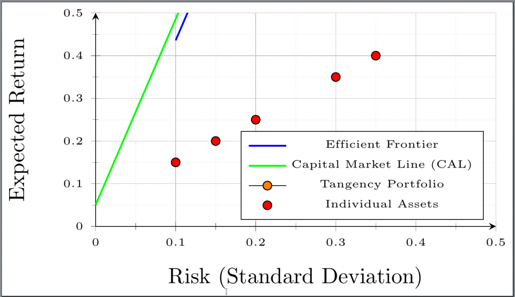
It does try hard to give me an Markowitz efficent frontier together with the Capital Allocation Line and the tangency portfolio but didn’t quite succeed. This is the final result of the prompts: “Now draw an Markowitz efficent frontier with some details”, “Can you add the CAL and the tangency portfolio?” and “Please don’t use path”. The latest command is necessary as my installation of Tikz doesn’t know about it but it appears to work in another version. The result isn’t great, by default the legend is over the points and I need to comment out the location of the tangency portfolio. That said, if one really wants to get this graph ChatGPT gives a great start and it writes around 40 lines of Tikz code in 2 minutes which I’m definitely not able to do.
A part of the efficient frontier with individual assets. The tangency portfolio has been commented out and the legend has been moved manually from ‘north west’ to south east.